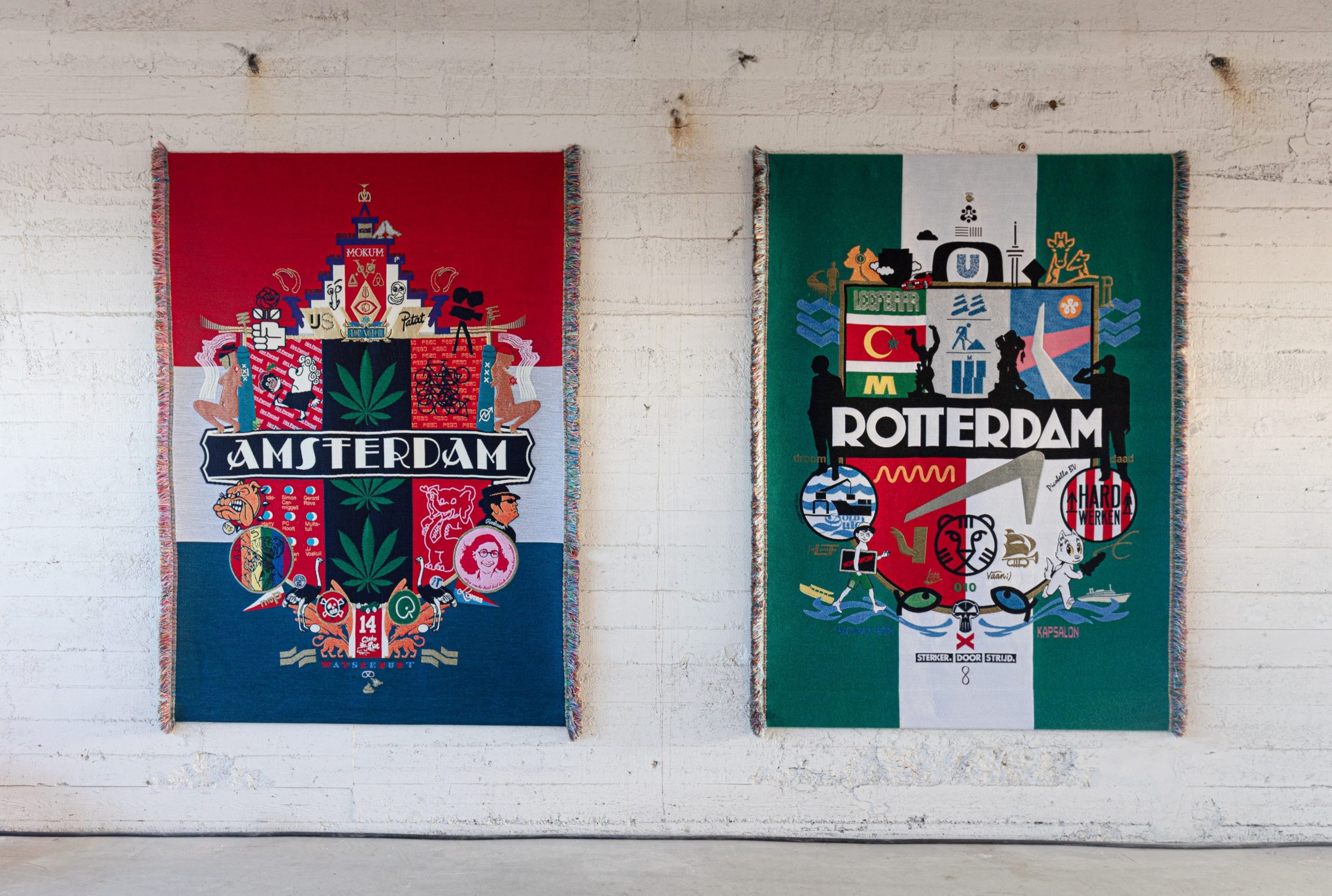
Rens Muis and Pieter Vos decided one day to find out what their graphic designs would look like as textiles. Since then, they have regularly booked time in the TextielLab. Their first woven tapestry is currently on display in the Kunsthal alongside two recent creations in a new style.
Design agency 75B named the exhibition in Rotterdam’s Kunsthal after their own hearts. ‘Klootviolen’, which loosely translates as ‘fiddling around’, refers to the free and unconstrained experimentation needed to produce good work, says Rens Muis. He and 75B co-founder Pieter Vos created a guerrilla campaign using leftover materials from the exhibition and what they had in their studio: odds and ends of sticker foil, paper, spray cans, paint, chalk and ink. The 350 posters they handmade and hung around the Netherlands’ largest cities draw attention to their collage on the walls of the Kunsthal. This brings together 27 years of experimentation: from quick sketches to fully developed designs, such as the brand identity and promotional campaigns for the International Film Festival Rotterdam and De Doelen concert hall. Between all the paper works on display, three woven tapestries developed in the TextielLab stand out.
Woven cities
A golden oldie, which also started as a poster, is the very first coat of arms that 75B made for Rotterdam’s stint as European Capital of Culture in 2001. It is a traditional coat of arms complemented by modern icons. Eighteen years later, the duo decided to update the design and turn it into a woven fabric. “We wanted to give the idea a more appropriate materialisation,” says Muis. “In these coats of arms, we play with the contrast between classical and contemporary imagery. As a traditional technique, weaving adds to that interplay. In fact, coats of arms and heraldry were often converted into tapestries in the past.” The shield and the phrase ‘Stronger through Struggle’ depicted on Rotterdam’s traditional coat of arms are still included, but the other symbols have been replaced: the two lions have made way for more recent local icons such as poet and writer Jules Deelder, politician Pim Fortuyn and comic strip character Tom Poes. Meanwhile, the crown above the shield is now an amalgamation of Unilever’s logo, the Euromast and Boijmans van Beuningen museum. In total, the design features more than 100 contemporary references. Can’t identify them all? There is a handy legend to help.

The Amsterdam and Rotterdam coats of arms as woven tapestries at Object 2020. Photo: Willem Kaldenbach.
Tourists and collectors
As a Rotterdam-based agency, Muis and Vos decided to make another coat of arms for Amsterdam as a joke. Nine more cities followed, for which Muis and Vos gathered input like eager tourists and symbol collectors. All except Los Angeles have been turned into woven tapestries. Consequently, the graphic designers have regularly found themselves in the TextielLab’s weaving department in recent years with product developers Stef Miero and Lotte van Dijk. They often reserved time in the lab without knowing exactly which city they would be working on at the time. Everyone assumed that they would be back to develop another coat of arms this spring. But experimentation once again took over. The result is two larger-than-life phone screens, which reflect the designers’ love-hate relationship with their telephones.
Love-hate relationship
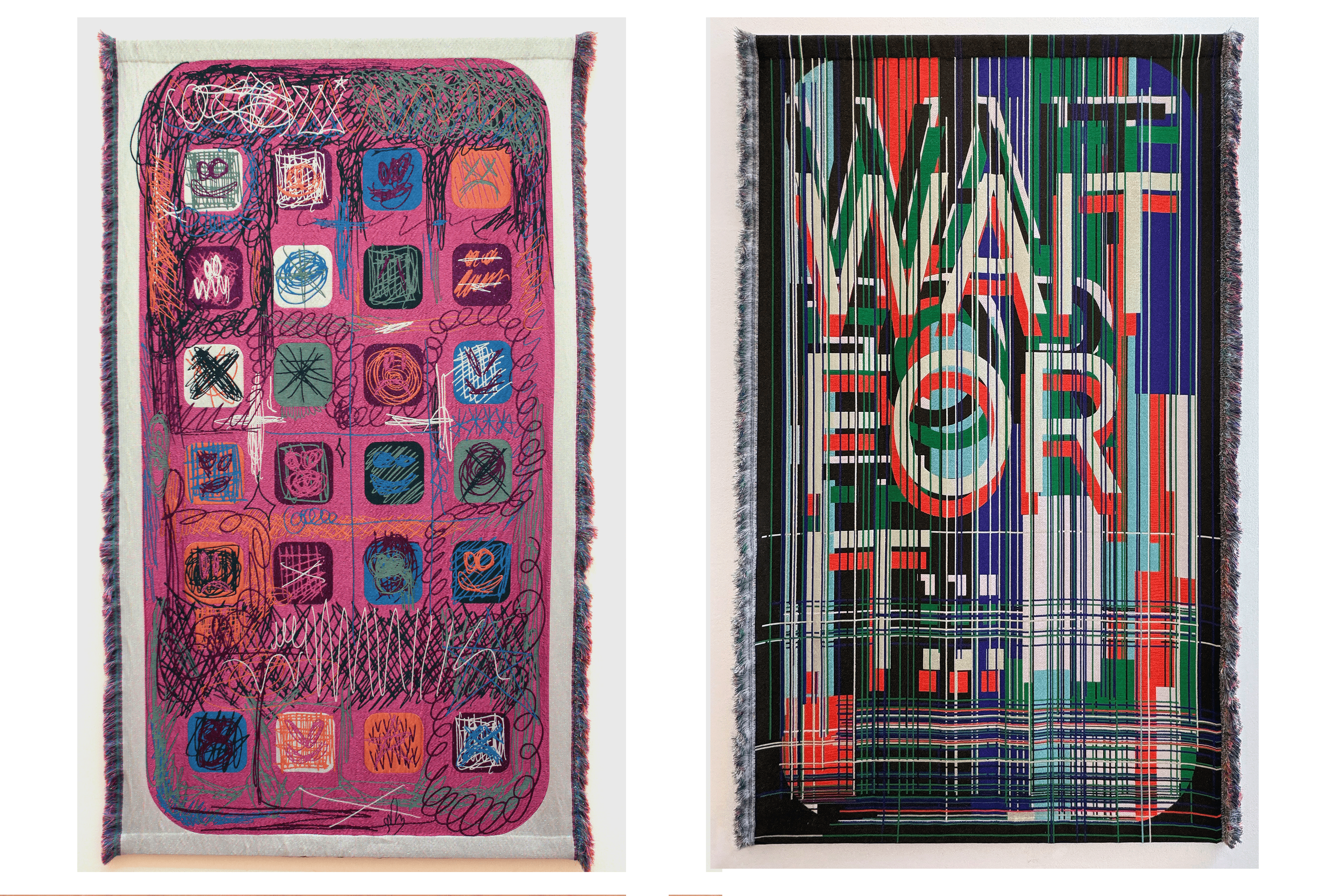
‘HOME’ and ‘WAIT FOR IT’ completely skipped the paper stage of the coats of arms. In these works, the interplay between traditional and contemporary is reversed. The design starts in the present, with an iPhone screen. ‘HOME’ shows a home screen filled with rows of typical app icons. “It’s a tribute of sorts,” says Muis. “But then we messed around with the interface by scribbling over it with a ballpoint pen and drawing loads of other things on top of it.”
The second tapestry depicts the words ‘WAIT FOR IT’, which often appear at the start of social media videos to keep viewers watching. But here the irritation of yet another frozen screen has been transformed into a work of art. “We turned those hard digital screens into a classic, analogue shape,” says Muis. “Weaving softens the image, makes it warmer and gives it more soul. Textile not only softens the lines but also the appearance. That’s ultimately what we’re aiming for. It’s less about the aesthetics and more about what is being communicated.”

‘HOME’ (left) and ‘WAIT FOR IT’ (right) at the Klootviolen exhibition. Photos: 75B
Unpredictable
The two new tapestries were made in collaboration with product developer Lotte van Dijk, with whom they experimented extensively with colours. Muis explains how, with the first coats of arms, they spent a lot of time investigating the best way to convert their CMYK colours into the right yarns. “We have a printing mindset. There are some similarities between a loom and a printing press, but blending up to 12 colours actually works very differently. It’s difficult to predict the outcome in advance. It depends not only on the colour of the thread, but also on the thickness, structure and weave.”
Although they still occasionally look for the exact colour of a logo, Muis and Vos let some of that precision go for this new series. And while the weaving programme for the tapestries was developed with the CMYK and RGB printing colours, the team subsequently experimented with different yarn combinations on the loom and produced numerous samples. ‘HOME’ and ‘WAIT FOR IT’ were eventually woven as a double cloth in a satin weave. This produces the richest colours – and an attractive back. “The backs of tapestries are completely unpredictable,” says Muis. “But that might make them even more beautiful than the front.”
Klootviolen runs in the Kunsthal until 30 June
Text Willemijn de Jonge
– Rens Muis (75B)